
The Search landscape has changed drastically; users search with different types of devices in different formats and the information is accessible right away through rich snippets, images, critic reviews markup instructions, direct answers with carrousels, Knowledge Graph cards and with smart business implementations like having your local business integrated with google maps. In a sense, Google has been evolving into becoming more of an answer search engine, in that the information is available to the user right away, no need to click on a site link.
In the USA, 94% of people with smartphones search for local information on their phones. Furthermore, Google found that 77% of mobile searches occur at home or at work–these are places where desktop computers are likely to be present. This clearly shows that mobile use is surpassing desktop.
Why make a website mobile-friendly?
The desktop version of a site might be difficult to view and use on a mobile device. The version that’s not mobile-friendly requires the user to pinch or zoom in order to read the content. Users find this a frustrating experience and are likely to abandon the site. Alternatively, the mobile-friendly version is readable and immediately usable.

For this reason, nowadays, there is no need to be the number one on search results or find those money making keyword(s) anymore . Rather, the smart approach is to gain competitive advantage and focus on increasing visibility by making the most out of all the new functionalities offered by Google. This, in order to attract more users to read you blog post, or to obtained visible ways to connect your data with your user by leveraging these functionalities along the way the user’s search stages.
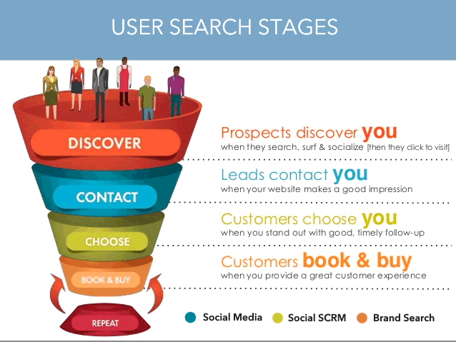
Users interact and use the different types of platforms when searching, when deciding and when buying. For example, users can identify your product or service through social media networks or come to your site and interact with your brand, but they may not buy right away. Yet, they are going to remember a few days or weeks later, and now convinced, they are going to search for the brand and make that purchase– and that called brand search.
Implementing the new Google smart functionalities
So how do we go about increasing visibility to connect with our users within different times and stages of the user search journey?
Around 2014, there was the so-awaited explosion of mobile search initiated by Google updates and support. As a result, Google launched countless tools and resources for businesses–and many for small businesses– to encourage not only web developers but also business owners to understand the benefits of implementing mobile-friendly website along with these new functionalities. Not only that but to push this update, Google publicly announced that they have begun taking mobile-friendly websites as a ranking factor in its search engine.
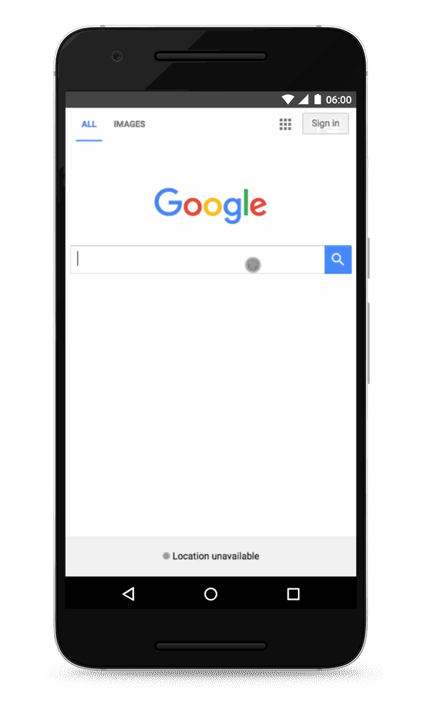
Here is an example of the strong push by Google to encourage mobile-friendly sites
What are the next steps?
- If your site was made by selecting a template or theme from third-party website software, check out Customize Your Website Software for Mobile Users, which can be the fastest way to become mobile-friendly!
- If you’re going to hire a web developer, check out our guide for hiring someone
- If you want more information on the mobile website implementation process, check out our docs on Mobile SEO.
- If you’re ready to build a mobile-friendly site, choose responsive web design. View our docs on Mobile SEO or go straight to Web Fundamentals and Principles of Site Design.
- If you’d like to learn more about making your business mobile-friendly, we recommend: The Mobile Playbook, Think with Google for the Mobile Platform, and Google’s Multi-Screen Success Stories.
No matter which step you choose next, choose to go mobile!
Google provides an Introduction to Structured Data Type Guide for web developers, and for non-developers there is wealth of information about best practices for mobile-friendly websites. Google understand that mobile means listening to music or videos, and for that, it also provides video best practices guide.
Here is a list of some of mobile-friendly website tools and resources offered by google:
- Mobile Friendly Test
- Getting Started with Mobile-frienly websites
- Mobile SEO configurations and best practises
- guide to customize your website software.
- checklist of things to care about when hiring a web developer
- Mobile SEO Guide for non-technical people
- Mobile SEO common mistakes
- Web Fundamentals.
- oogle Web Designer
- Smartphone Crawl Errors
- Responsive web design
- Google PageSpeed Insights
- Accelerated Mobile Pages Project
Even Bing.com began implementing similarly functionalities by offering tools such as the Mobile Friendliness Test Tool.
Google goes as far as asking web advertisers to use Smart App Banners (for Safari) or Native App Banners (for chrome) instead of Interstitial ads. It even tells web designers to avoid using small font size by offering font size best practices with the use of Legible Font Sizes, and to avoid setting touch elements such as buttons and links so close to each other in order to achieve a better UX user experience by using Size Tap Targets Appropriately.

Google offers tools to test for their Accelerated Mobile Pages Project (AMP) with tools that can only be used through mobile devices, not desktop computers like g.co/ampdemo. Plus, google invites everyone to get involved and contribute to the AMP Project.
I encourage not only online marketers but business owners to explore all these free available tools and resources with your employees, developers and stakeholders. Find ways to implement all these new functionalities Google is putting in the palm of our hands to gain a competitive advantage and to grow your business in a smart way.
Good luck! 🙂